Graphics at the New York Times — and how data journalism changed everything
Portfolio | Writing | Data Teams | Journalism
September 2024
"If we aren't read, we aren't going to change the world." — Dean Baquet, Managing Editor, NYT
Keeping Up with the Times
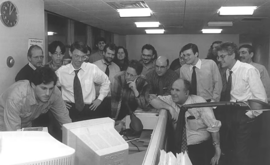
On the evening of January 21, 1996, a group of a dozen men perched over a newsroom computer and marked a milestone: "The New York Times Introduces a Website." In 1995, the newspaper had formed a digital media company "to develop products for the rapidly growing field of digital publishing." However, the rather anticlimactic launch of the site was met by many of the traditional print journalists at the paper with disdain. That would soon change.
The launch of nytimes.com began a new era for journalism, beginning with a change in how reporters worked and later becoming an entire discipline unto itself. This evolution would not have been possible without Richard Meislin, the Times' first Head of Digital. His internal memo, "What is the Internet," briefed the "masthead" executive leadership team on the potential of digital. "The New York Times is about to establish an online personality, both visual and verbal . . . How we combine elements, make information available, and interact with readers will make huge differences in how we're regarded online." Starting in a separate office in the Hippodrome, the groundwork was laid for the digital teams to form — protected from the machinations of the newsroom until the Times moved into a new office in 2007.
Graphics at War
NYTimes.com forced the newspaper to change how it viewed itself. The paywall went up in 2011 as the Masthead ceded to changing reader behaviors. In 2014, Managing Editor Dean Baquet restructured the teams to encourage collaboration between the newsroom and the "business side." Creative Director Tom Bodkin assigned graphics editors to traditional desk teams — National, Business, Politics, and others.
The graphics editors at NYT had already become data journalists. They could develop stories on their own or in collaboration with the "desk heads." One early example was the team's response to 9/11. Archie Tse, the paper's current graphics editor, drew the visuals of the twin towers' architecture for the Times' coverage of the attack. Later, Tse spent years traveling to Baghdad to report on the Iraq War. "When you stay out in the field, you develop a sense of geography and chronology," Tse said. "Graphics are a team effort. One person might sketch, another will report, and possibly a third person would work on doing the chronology." Tse is also credited as having created the red-and-blue color schemes common to current political map visuals.
By 2010, NYT hired more digital-native reporters like Nate Silver, the creator of 538, to track political, polling, and survey statistics. In 2013, the team developed the first interactive graphic "Snow Fall" to document the 2012 Tunnel Creek avalanche, winning a Pulitzer Prize.
Charting New Territory
Like how the early digital group grew isolated from the newsroom, a new San Francisco office opened to explore interactive graphics. Mike Bostock joined in 2013 to lead this effort. Along with designer Shan Carter, Bostock would often take as long as three or four weeks to design a visual — ages compared to the daily schedule in Manhattan. Their proximity to Silicon Valley helped make their work more technical. In fact, Bostock developed D3.js, an open source JavaScript library for developing interactive visualizations online. Rather than strictly following typical journalistic rules, Bostock and his colleagues would explore data relevant to current events with D3, employing peer code reviews and automated validation to ensure quality. The Times won the Gerald Loeb Award for Business and Financial Journalism for their "Economy Interactives" each of the next three years. Today, D3 remains one of the most widely used interactive visualization libraries for developers.
Some of the prompts for Bostock's visuals came from Amanda Cox. The Data Editor for the Times in the late 2010s, Cox earned a reputation for rationalism. She started as an intern out of grad school, redesigning all of the visuals in her interview exam with the programming language R. Within a few years, she earned the role of editor for the Upshot feature. When the Times editors Slack with each other, they often wryly use an emoji alias meaning "no one knows anything" — a picture of Cox. After she helped develop landmark visuals like the infamous needle that turned red late on the night of the 2016 election, Steve Duenes created a new team leadership role for her. The last person to hold a similar title as Data Editor? Richard Meislin, Editor of Statistical News. Full circle.
Despite their central position today, the graphics team at NYT had to contend with onerous office politics along the way. For years, the digital teams were cut off from normal newsroom operations, an afterthought at best. Micromanagement, hierarchy, and approvals made agile development impossible. The old guard who cut their teeth in print viewed graphics and subscriber statistics as anathema to good journalism.
Nevertheless, the New York Times graphics team came to epitomize data journalism — and pushed boundaries precisely because of their separation from the traditional elements of the Times. By helping to centralize the role of digital in the newsroom and advancing reader expectations, they changed the industry forever.
Epilogue: The Changing of the Guard
Every day for 60 years, the Times' leadership gathered to decide on the lineup of articles for the front page of the print publication. In 2015, Baquet declared the daily meeting would become a forum for planning digital coverage. On May 8 that year, Baquet led the last meeting under the old format. "It is remarkable how fast all the desks have responded to a constant flood of change," he said, raising a cupcake in a toast. "Thank you, and cheers!" Journalism was never the same. Neither was data visualization.